


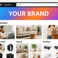


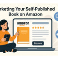


🧩 Why Basic Product Pages Just Don’t Cut It Anymore
In a world of short attention spans and visual-first shoppers, plain-text Amazon listings are… well, boring. If you're relying solely on bullets and descriptions, you're leaving conversions on the table.
Here’s the problem:
- 📉 Shoppers bounce without engaging visuals
- 💬 Product benefits get lost in text
- 😕 Buyers can’t emotionally connect with your brand
Result: Even with great SEO, your product doesn’t convert.
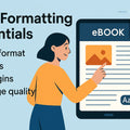
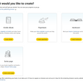
🎨 Enter A+ Content: Where Storytelling Meets Selling
A+ Content (aka Enhanced Brand Content) lets you go beyond the basics. Think:
- High-quality visuals
- Feature breakdowns
- Brand story modules
- Comparison charts
- Lifestyle imagery
✅ And best of all? It can boost your conversion rate by up to 20%.
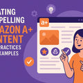
✨ The Creative Framework: 5 Steps to Irresistible A+ Content
1. Hook with a Bold Hero Image
Think of this as your product’s movie poster. It should:
- Showcase the product in use
- Include a headline that speaks directly to a problem or desire
- Match your brand vibe (elegant, fun, minimal, etc.)
🎯 Pro Tip: Use MidJourney or Canva to design a lifestyle banner that screams “buy me.”
2. Tell a Micro-Story with Each Module
Don’t just list features—show how they change your customer’s life.
✍️ Instead of: “Includes 450W motor”
Say: “Crushes frozen fruit in seconds with a whisper-quiet 450W motor—so your toddler keeps napping.”
3. Design with Contrast & Clarity
Use modules like:
- Side-by-side images
- Infographics for features
- Step-by-step visual how-tos
- Before/after scenarios
💡 Keep colors clean and on-brand. Avoid text walls. Let the visuals do the work.
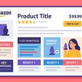
4. Use Comparison Charts to Anchor Value
People are skeptical. Use charts to show how your product wins over competitors:
- ✅ More power
- ✅ Longer battery
- ✅ 2-year warranty
It’s one of the most conversion-driven modules in A+ Content.
5. Close with Credibility
End your A+ with:
- Brand story or mission
- Customer quotes or reviews
- A “Why Choose Us” block
It builds trust—and trust closes sales.
🧠 Real Brand Example: KitchenTech Blender
Their old listing: All text. No visuals. Just specs.
Their new A+ Content:
- Hero image showing smoothie prep
- Icons for blade speed & safety lock
- Chart comparing it with Ninja & Oster
- 5-star reviews as image callouts
📈 Result? A 28% conversion boost in 45 days.
📦 Tools to Make It Happen
- Canva Pro – for pro-level layout templates
- MidJourney – for eye-catching product visuals
- Amazon A+ Manager – to build and preview content
- PickFu – to test image layouts with real buyers
- Figma – for advanced visual flow planning
🔗 Internal & External Links
🔥 Final Words: Design to Sell, Not Just to Show Off
A+ Content is your chance to go beyond specs—and into your customer’s heart.
Make them feel. Make them see. Make them click “Add to Cart.”
🎨 If your listing was a Netflix trailer… would they watch it?
If not, you’ve got work to do. And A+ Content is where it starts.


Comments
Leave a comment